
Use Your Equipment Data to Tell a Bigger Story
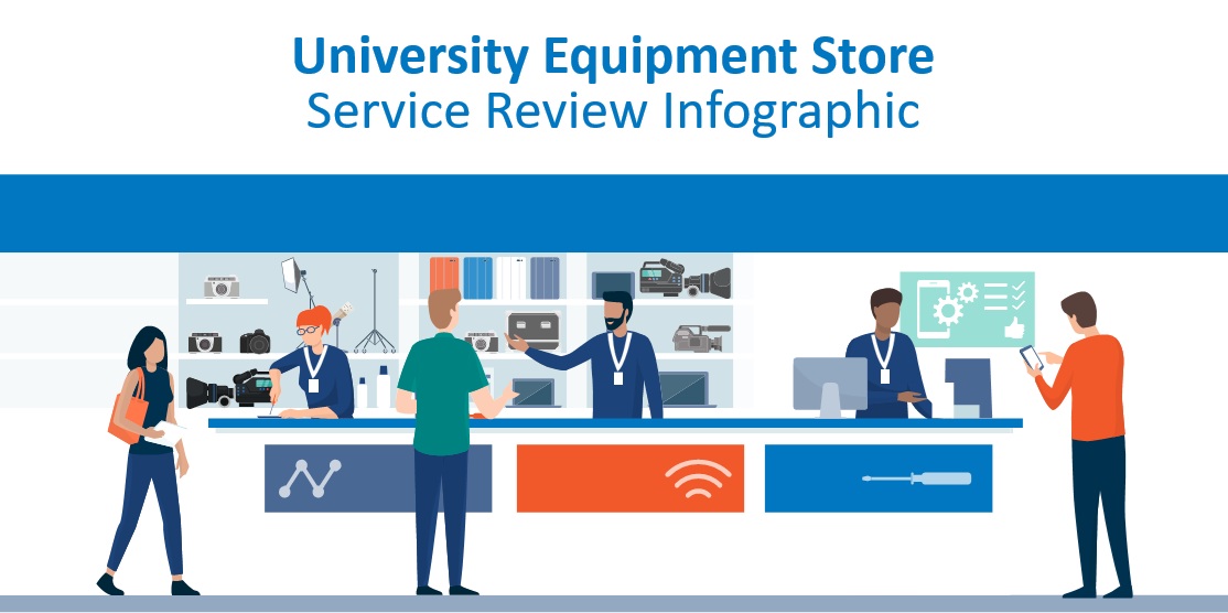
Showcase student engagement, service achievements and return on investment with our editable infographic – in Part 2 of our utilization focus series.
University equipment stores give students access to the cameras, lighting, microphones, studios and other specialist resources they need to turn ideas into practical work.
Managing these services is a significant undertaking. A university may have hundreds – or even thousands – of individual items in circulation, supporting student cohorts across numerous modules and projects. Behind every successful loan is a team working to maintain equipment, manage access, prepare bookings, support users and keep valuable assets moving efficiently.
Yet the scale and impact of this work are not always visible beyond the service itself.
That is why equipment usage data matters. When it is presented clearly, it can demonstrate how effectively a service is supporting students, how well university resources are being used and how much value staff are delivering.
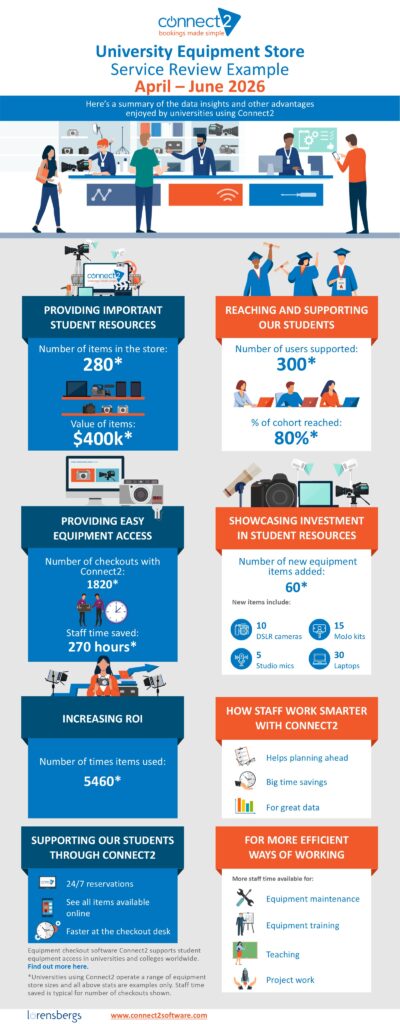
To help universities tell that story, we have created an editable University Equipment Store Service Review infographic.
Put Your Equipment Data to Work
In Part 1 of this series, Equipment Checkout KPIs: The Metrics That Matter Most, we looked at the analytics that can help universities understand the reach and performance of an equipment loan service.
These include measures such as:
- – Number of unique users
- – Total reservations or checkouts
- – Size and value of the equipment inventory
- – Total number of times resources were used
- – Number of new resources added
Together, these metrics can help equipment managers assess demand, identify trends, support purchasing decisions and demonstrate return on investment.
But collecting the data is only part of the opportunity. It also needs to be communicated in a format that people can understand quickly.
A spreadsheet or detailed report may be appropriate for operational analysis, but an infographic can provide an immediate snapshot to help visualize the service’s value.
Please note: The figures in the example infographic are illustrative. They do not represent the performance of a particular university or equipment service.
Click on the infographic to download the editable version – in powerpoint format for easy customization.
What can the infographic help you communicate?
The downloadable template displays a selection of data that gives a clear overview of an equipment service and its contribution to the university.
The resources available to students
Showing the number and value of items managed helps audiences understand the scale of the service.
A store containing several hundred cameras, microphones, lighting kits, laptops and related accessories represents a substantial university investment. Including the value of those assets helps place the work involved in managing and maintaining them in context.
It also reminds students of the range and quality of resources available to support their studies.
The number of students supported
The number of unique users provides a straightforward measure of reach.
It can show senior managers that the service is supporting a significant proportion of a department, school or student cohort. It can also demonstrate that students are actively engaging with the practical resources made available to them.
The volume of equipment activity
The total number of checkouts and individual item uses shows how much activity takes place behind the scenes.
A service may support hundreds of students, but each student can make multiple bookings and borrow several items at a time. The number of checkouts therefore helps communicate the scale of the workload more fully.
Total item usage can also provide strong evidence of return on investment. Valuable resources are not simply being stored: they are being repeatedly used to support practical learning, assignments and creative projects.
Continued investment in resources
Highlighting new equipment additions demonstrates that the university is continuing to invest in the student experience.
The infographic can be personalized to show the number and types of resources added during the reporting period. These might include new cameras, MoJo kits, mics, laptops or other specialist tools.
This is useful for showing students what is newly available while also recognizing the funding and planning that made the investment possible.
The operational benefits of the service
Not every benefit needs to be expressed as a financial figure.
Universities can also use the infographic to promote service highlights, such as:
- 24-hour self-service reservations
- Full online catalog of resources
- Fast collection and checkout processes
- More staff time available for teaching or project support
Useful for leadership, students and service teams
The same infographic can support several different conversations across the university:
Reporting to senior managers
Senior leaders may not be familiar with the day-to-day activity of an equipment store. A concise visual summary can quickly communicate:
- The value of assets under management
- The number of students benefiting from the service
- The level of demand for equipment
- The return being achieved on previous investment
- The case for maintaining or increasing future funding
This can be particularly useful as part of an annual report, departmental review, budget discussion or funding proposal.
Promoting the service to students
Usage statistics can also be powerful promotional messages. They can build awareness and encourage further engagement.
The infographic could be shared through student newsletters, departmental webpages, social media, posters and digital displays, induction materials or open-day presentations.
It can help students understand that the service is available for them and that their peers are already making good use of it.
Recognising staff contribution
High service activity does not happen by itself.
Staff must manage bookings, prepare equipment, complete checkouts and returns, investigate faults, arrange maintenance, deliver training and help students choose appropriate resources.
Sharing service statistics gives teams visible evidence of what they have achieved.
Download and personalize the PowerPoint template
We have produced the infographic as an editable PowerPoint file so that universities can replace the example figures with their own results.
You can customize:
- The reporting period
- Inventory size and value
- Number of users supported
- Percentage of the relevant cohort reached
- Number of bookings or checkouts
- Total item usage
- Staff time saved
- New equipment additions
- Service benefits and promotional messages
For Connect2 customers, the underlying inventory and usage statistics are available from the data held in their Connect2 system.
Download the editable University Equipment Store Service Review infographic
Give your equipment service the visibility it deserves
University equipment services make an important contribution to practical learning. They connect students with valuable resources, help departments maximize the use of their assets and support the production of ambitious academic and creative work.
The right data makes that contribution easier to see.
By turning usage analytics into a clear visual story, universities can celebrate student engagement, recognize staff effort, support future investment and encourage even more people to discover the equipment available to them.
Not currently using Connect2? Discover how Connect2 can help your university manage equipment reservations, checkouts, inventory and usage data.
Further Reading:
Part 1: Equipment Checkout KPIs – The Metrics That Matter Most